Rakan Tutor
UX Case Study (Responsive Web Design)
UX Researcher, UX Designer
Time Frame:
4 Months
Research Methods:
Field Research, User Persona, Competitor Analysis, Mood Board, Information Architecture
Background
--------
The Client:
Rakan Tutor is a non-profit organisation founded in 2021 to combat the significant learning loss experienced by Malaysian students during the COVID-19 pandemic. The organisation provides free online Mathematics tutoring to Form 5 SPM (O-Level equivalent) students who lack access to private education. By offering this support, Rakan Tutor aims to bridge the educational gap for disadvantaged students, driven by the belief that every student deserves the opportunity to succeed, regardless of their circumstances.
The Challenge:
The COVID-19 pandemic caused significant educational disruption in Malaysia, leading to an estimated loss of 0.9 years of learning for students after just seven months. In response, Rakan Tutor launched a successful online tutoring program to help Form 5 SPM students overcome this learning loss. While the program achieved a remarkable 25% average improvement in student performance over three months, its reliance on a manual, one-to-one tutoring model has revealed two critical challenges:
- Inefficient Tutoring Sessions: Tutors are often left waiting for students to complete tasks, leading to unproductive session time instead of actively addressing student blockers or deepening their conceptual understanding.
- Scheduling Difficulties: Both tutors and students struggle with scheduling sessions promptly, leading to delays and missed learning opportunities. Since tutors are university students or young professionals and tutees have their own classes during the day, sessions are confined to a narrow window of evenings and weekends, making it hard to find a time that works for everyone.
My Tutoring UX Case Study
This case study documents my responsive, user-centered approach to one-on-one tutoring, highlighting how an iterative process led to a new vision for an online learning platform.----------
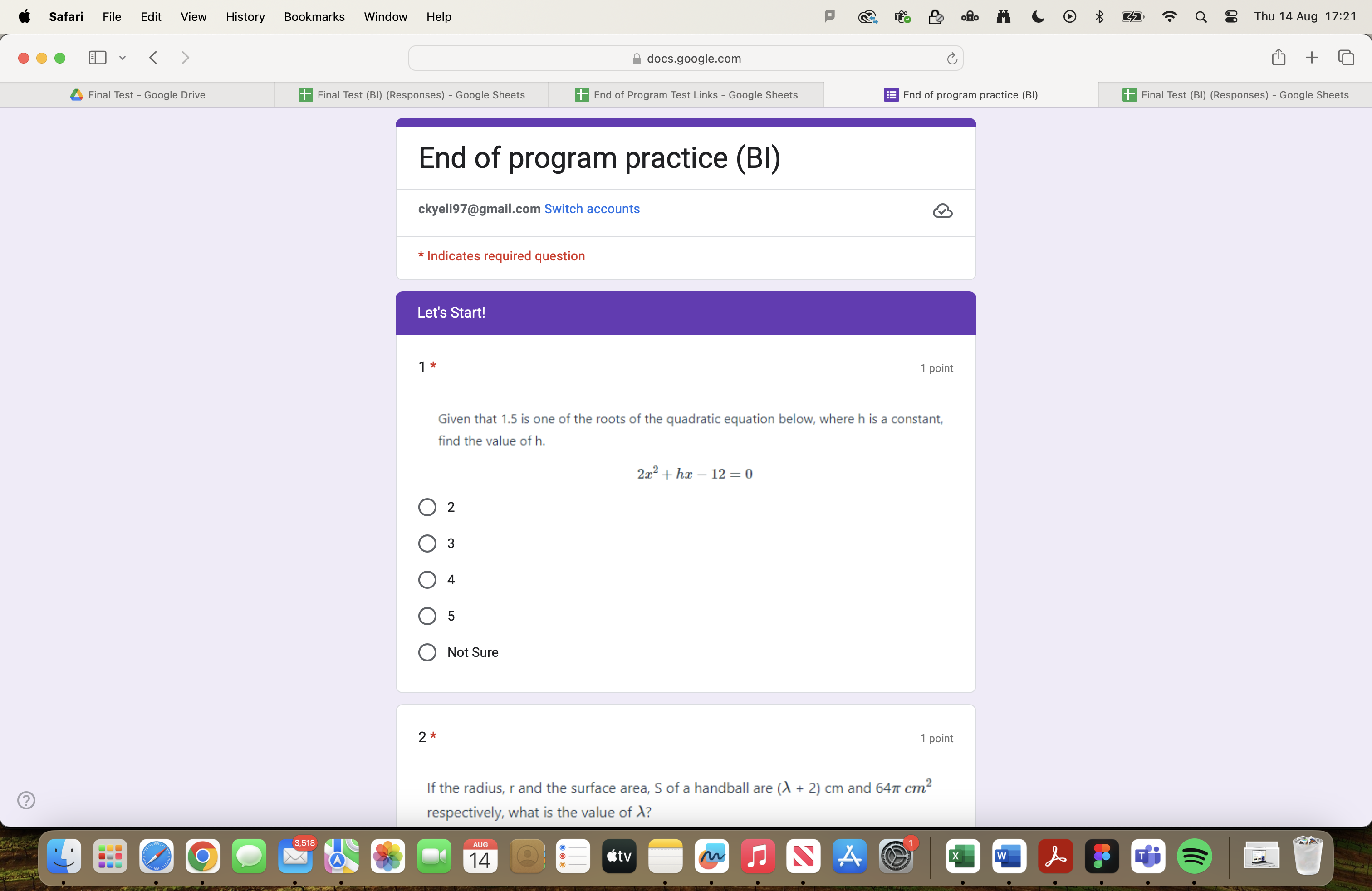
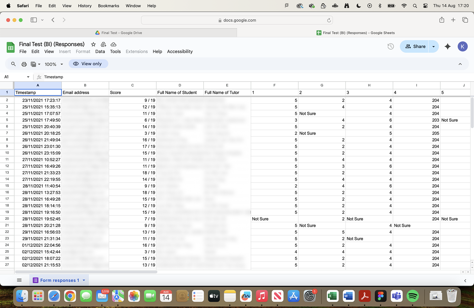
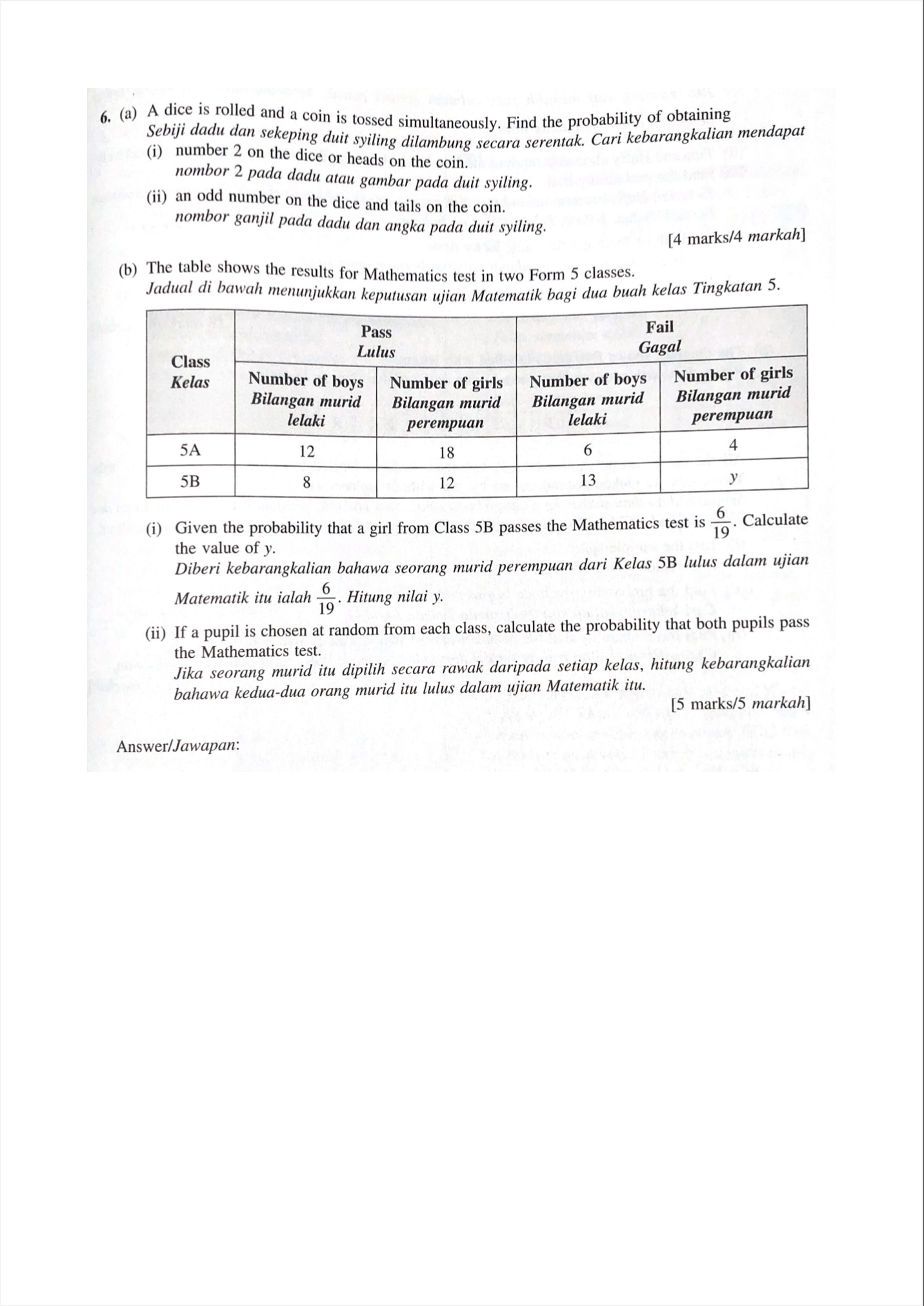
My tutoring process began with a discovery phase to build a student persona. I synthesised initial data points like academic performance and grades, conducted a formative diagnostic test to pinpoint areas of weakness, and held an interview to understand her learning preferences, schedule, and goals. This research was foundational to creating a highly personalised learning experience.

----------
Phase 2: Adapting the Lesson Plan
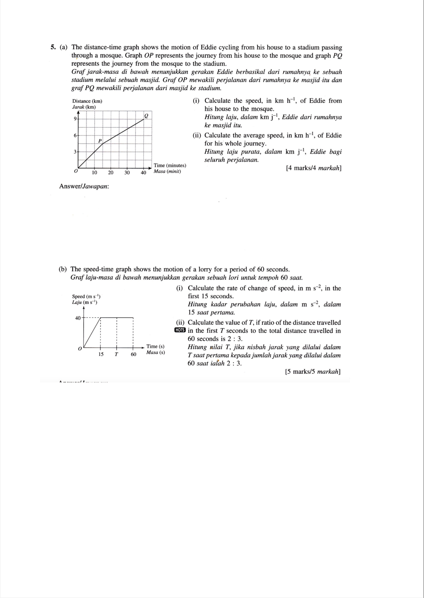
My initial plan was to provide pre-prepared questions for practice. However, observing the student's limited time due to schoolwork, I quickly pivoted our strategy to prioritise her own questions first. This flexible approach directly addressed her immediate needs.
In addition to this, I developed a strategy for continuous support outside of our sessions, encouraging her to send questions as they came up for just-in-time assistance and supplementing our lessons with multimedia resources like YouTube videos.
During sessions, I combat fatigue and confirm understanding by asking her to explain solutions back to me and by proactively switching subjects when I notice her losing concentration.


----------
Key Learnings & Future Opportunities
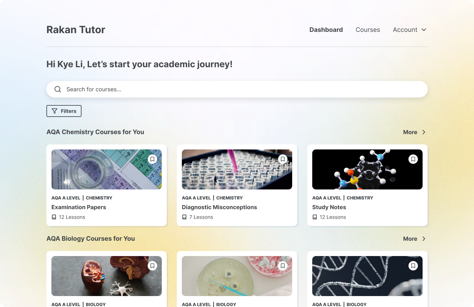
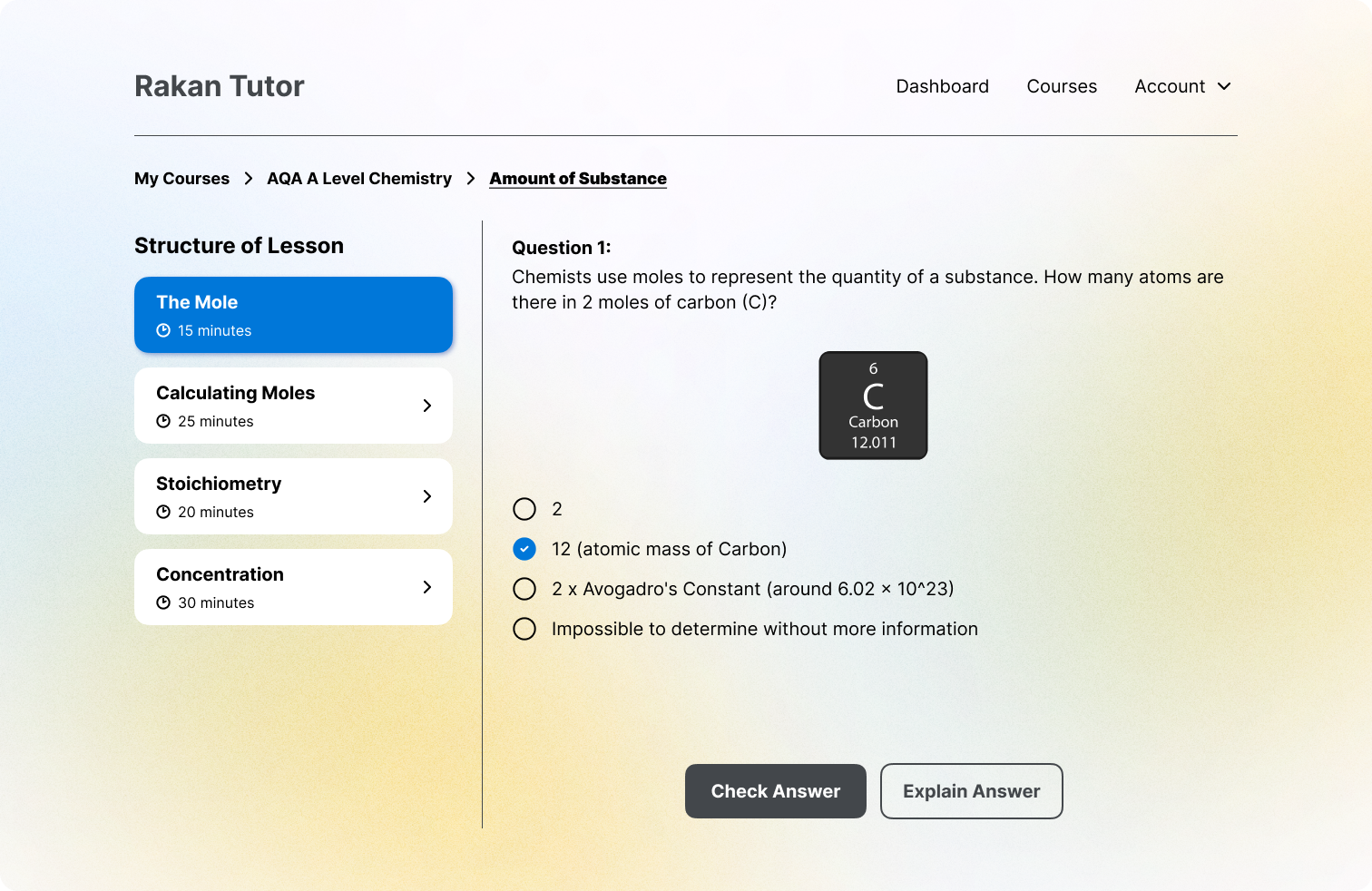
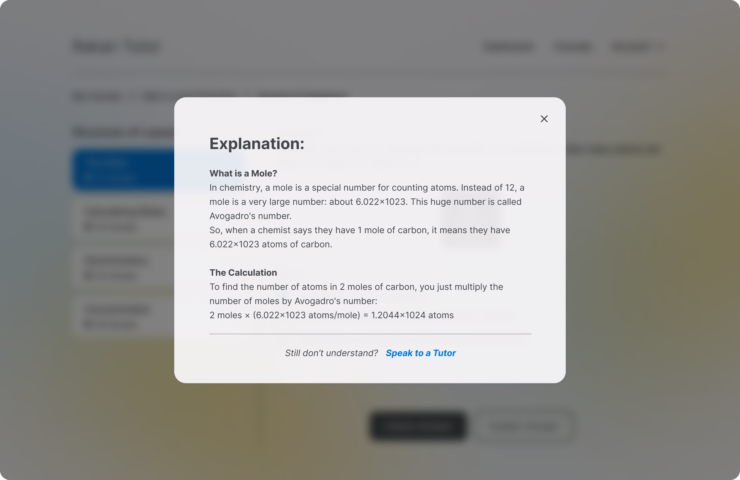
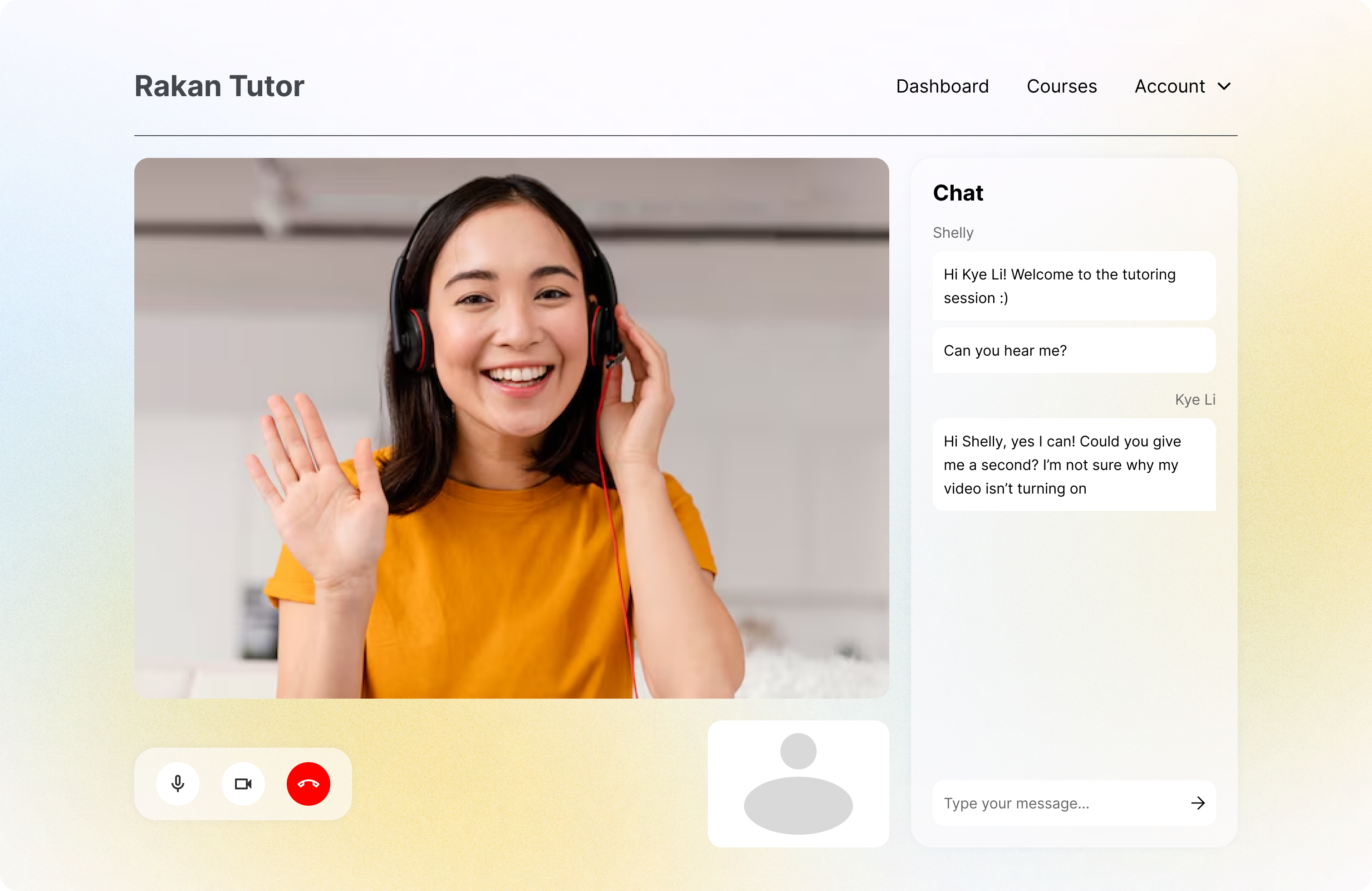
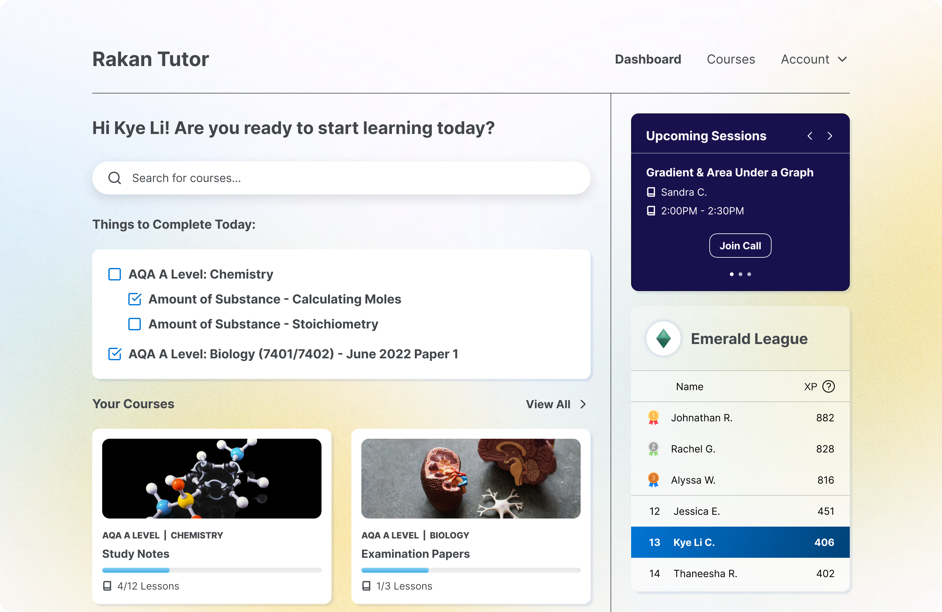
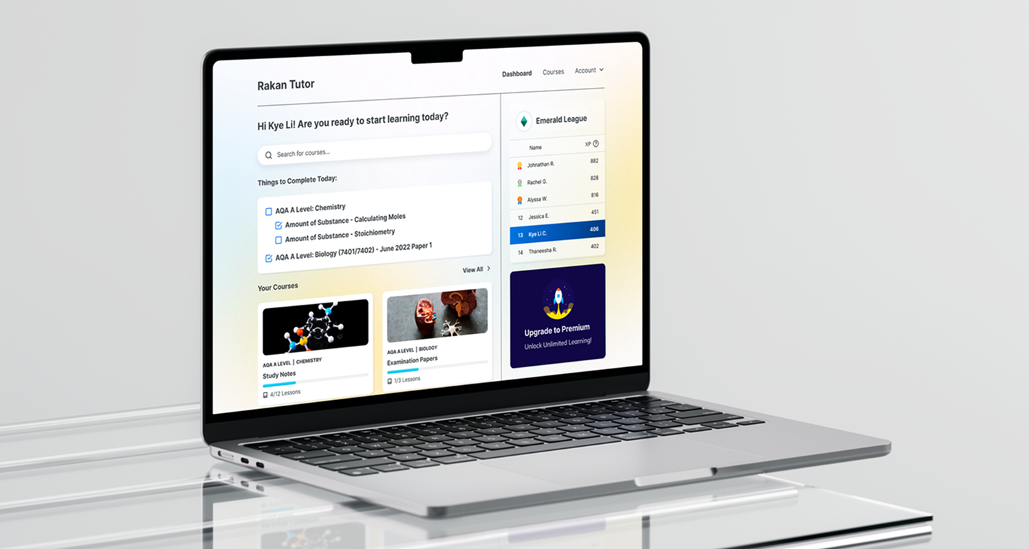
This experience culminated in a crucial realisation: an online learning platform could address the limitations of the manual tutoring model. This led to my vision for a platform that would be highly beneficial for students, especially those without access to private tutoring. By allowing students to learn at their own pace through interactive and gamified content, it would solve the problems of session inefficiency and scheduling difficulties. This platform could then be complemented by personalized, in-person tutoring when needed, creating a truly enhanced and accessible learning experience for all.
User Personas
A study was conducted to understand the needs, experiences, behaviours, and goals of the targeted users within the 'Rakan Tutor' program. Data were gathered from both tutors and tutees and used to create user personas, providing insights into the individuals involved in the learning process.
Market Analysis
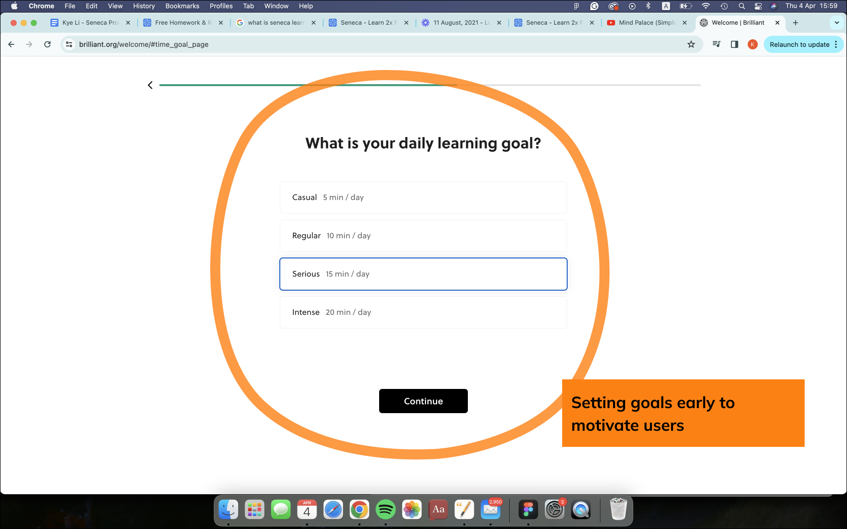
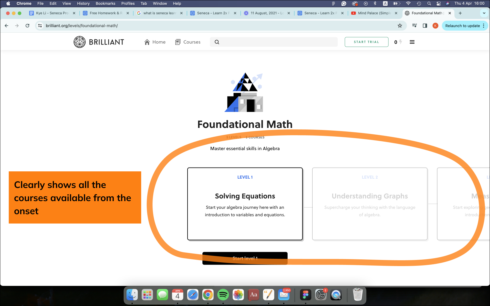
A short analysis on the various educational platforms to gain insights on their respective strengths and weaknesses.
- Brilliant (Launched in 2012, has 4 million users in 2017)



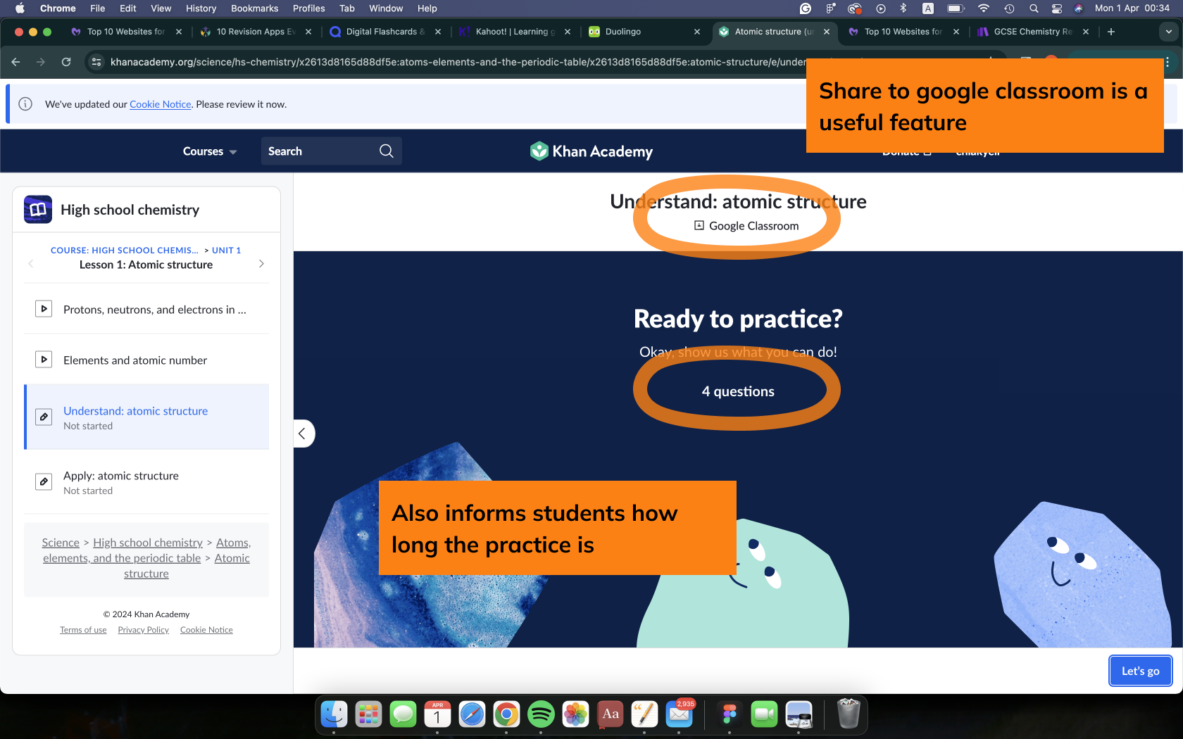
2. Khan Academy (Launched in 2008, has 137 million users in 2022)




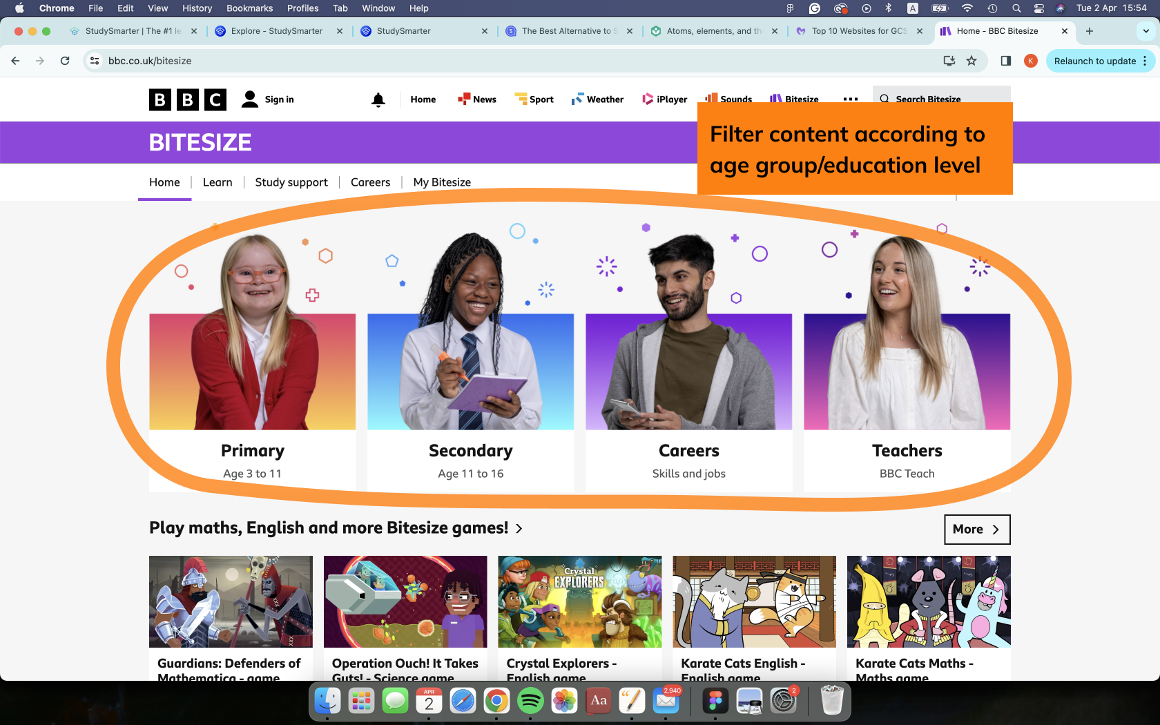
3. BBC BiteSize (Launched in 1998, has 3.8 million visitors per week on average in 2019)


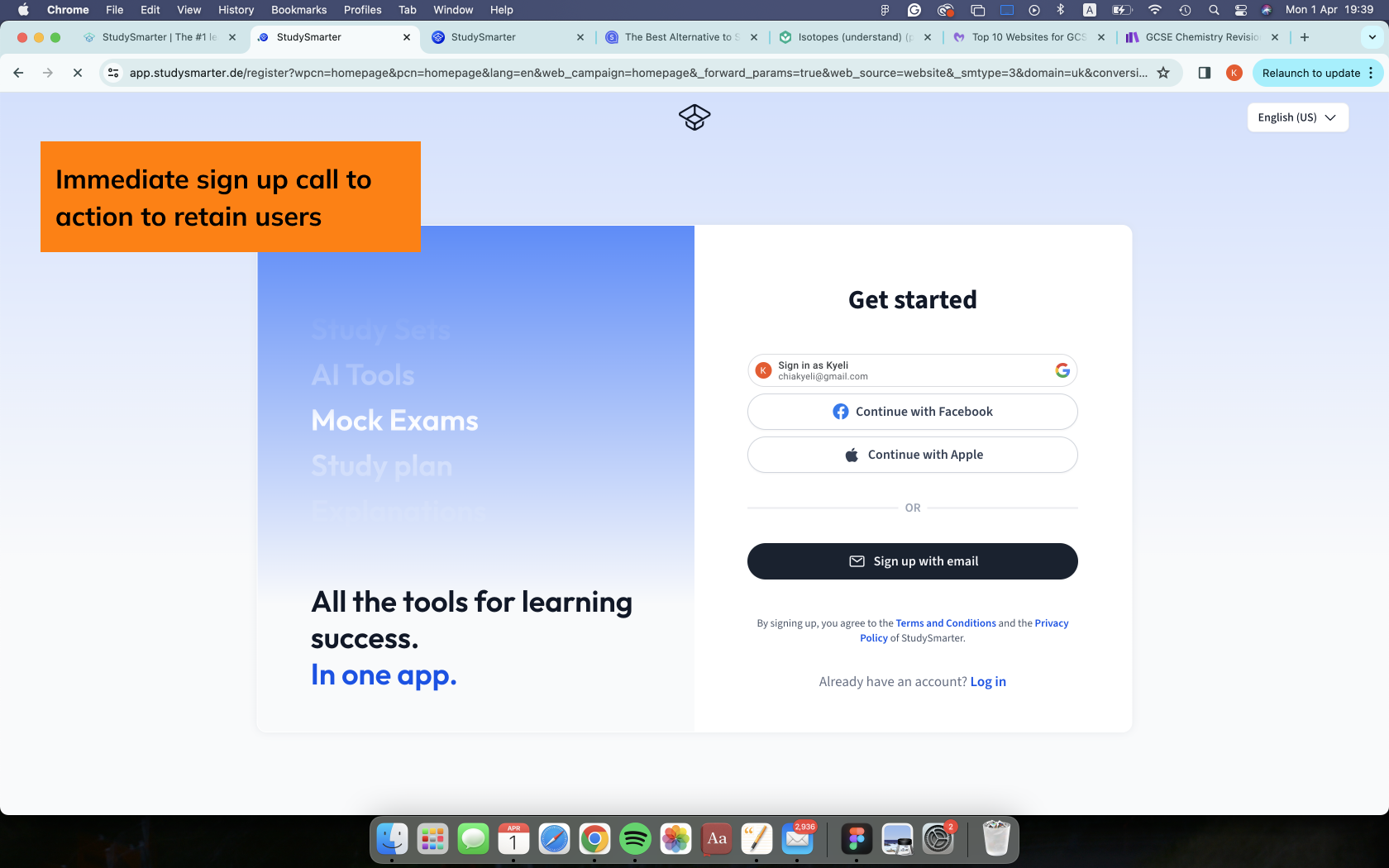
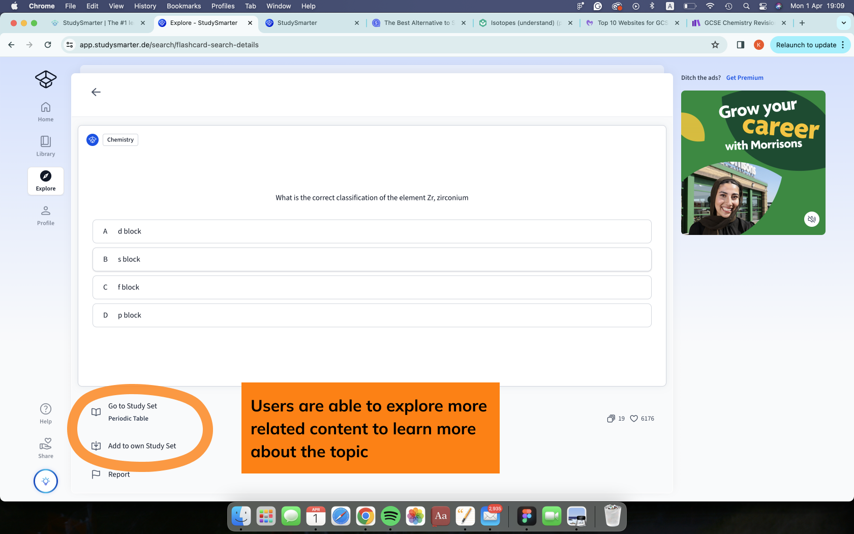
4. Study Smarter (Launched in 2018, has 1.5 million users in 2021)


Key Comparison:

Market Opportunity:
-
Existing platforms lack content aligned with the Malaysian KPM syllabus.
-
A gap exists for interactive, gamified content that moves beyond passive video lessons.
-
There is an opportunity to combine the best of digital learning with human tutoring for a more personalised experience.
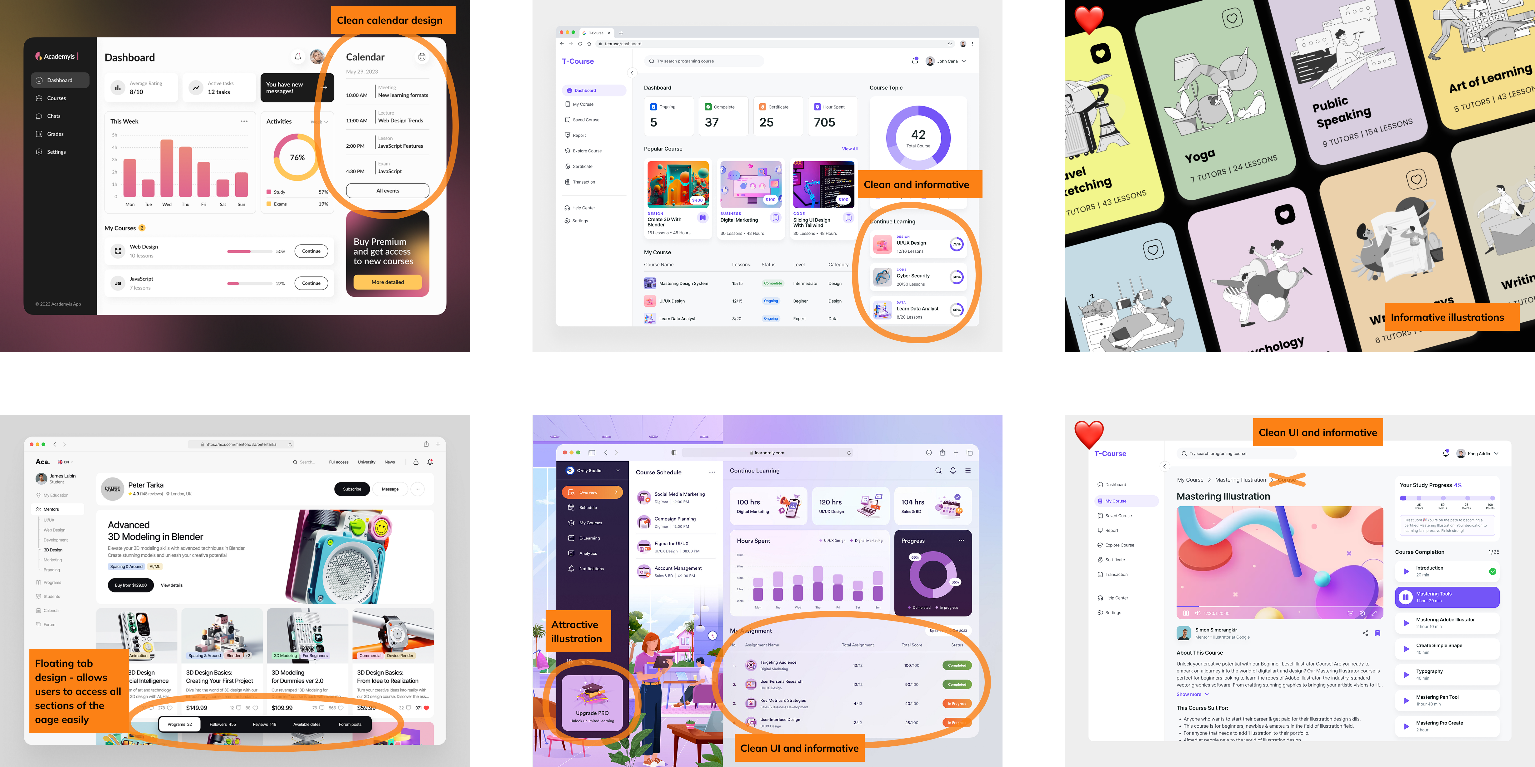
Mood Board

Information Architecture
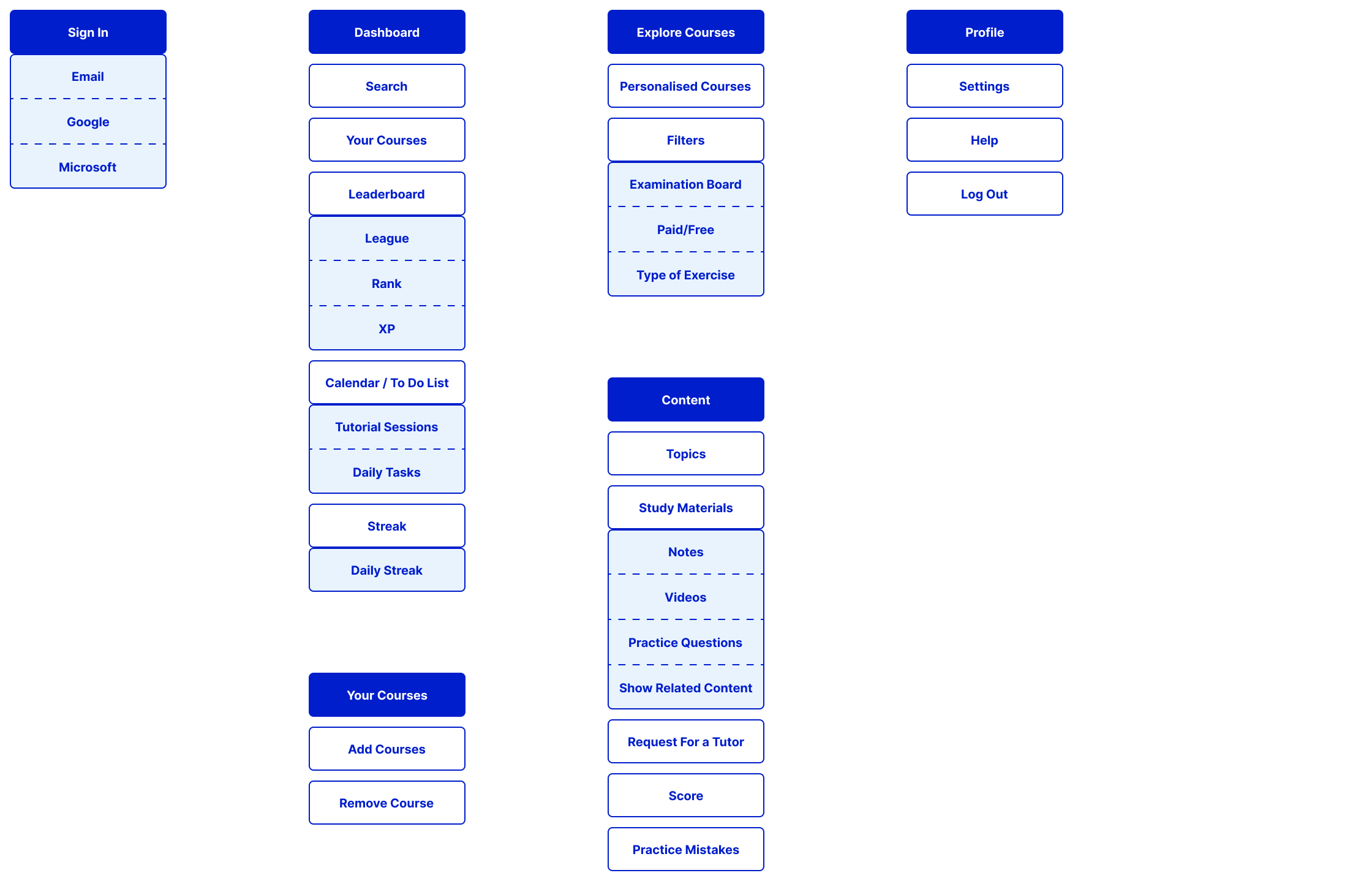
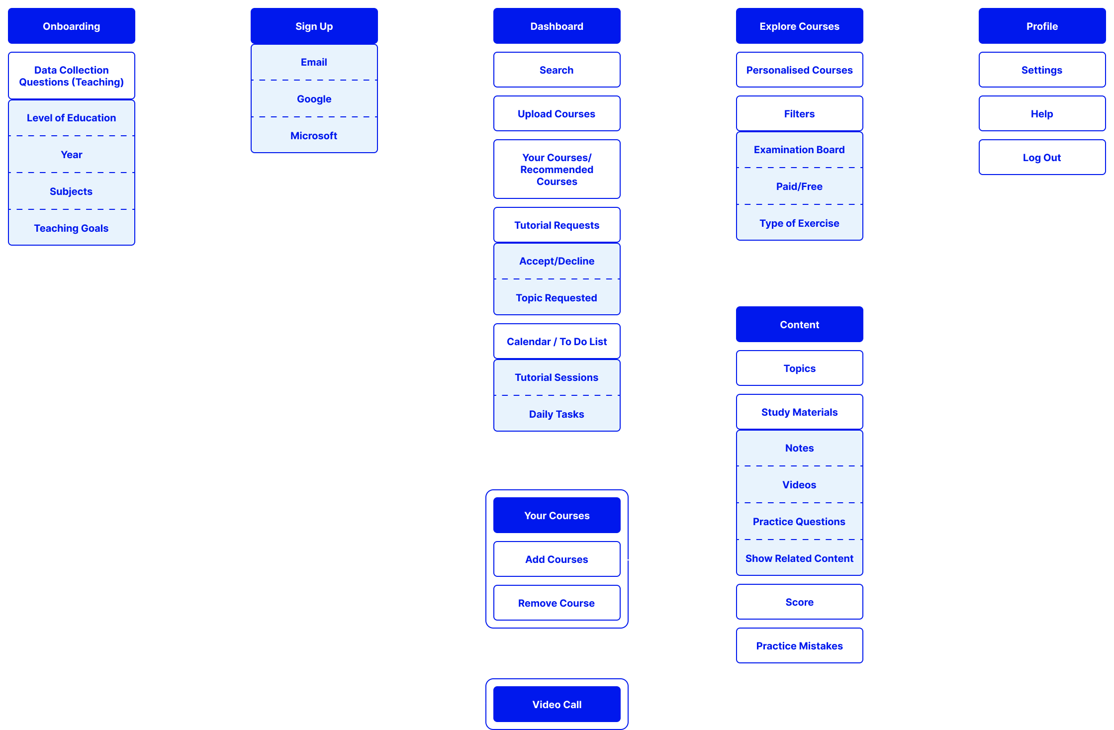
A simple organisation and division of content is the done to provide the users with a well structure interface.
- First Time Users (Students)

2. Students
3. Teachers
Wireframe
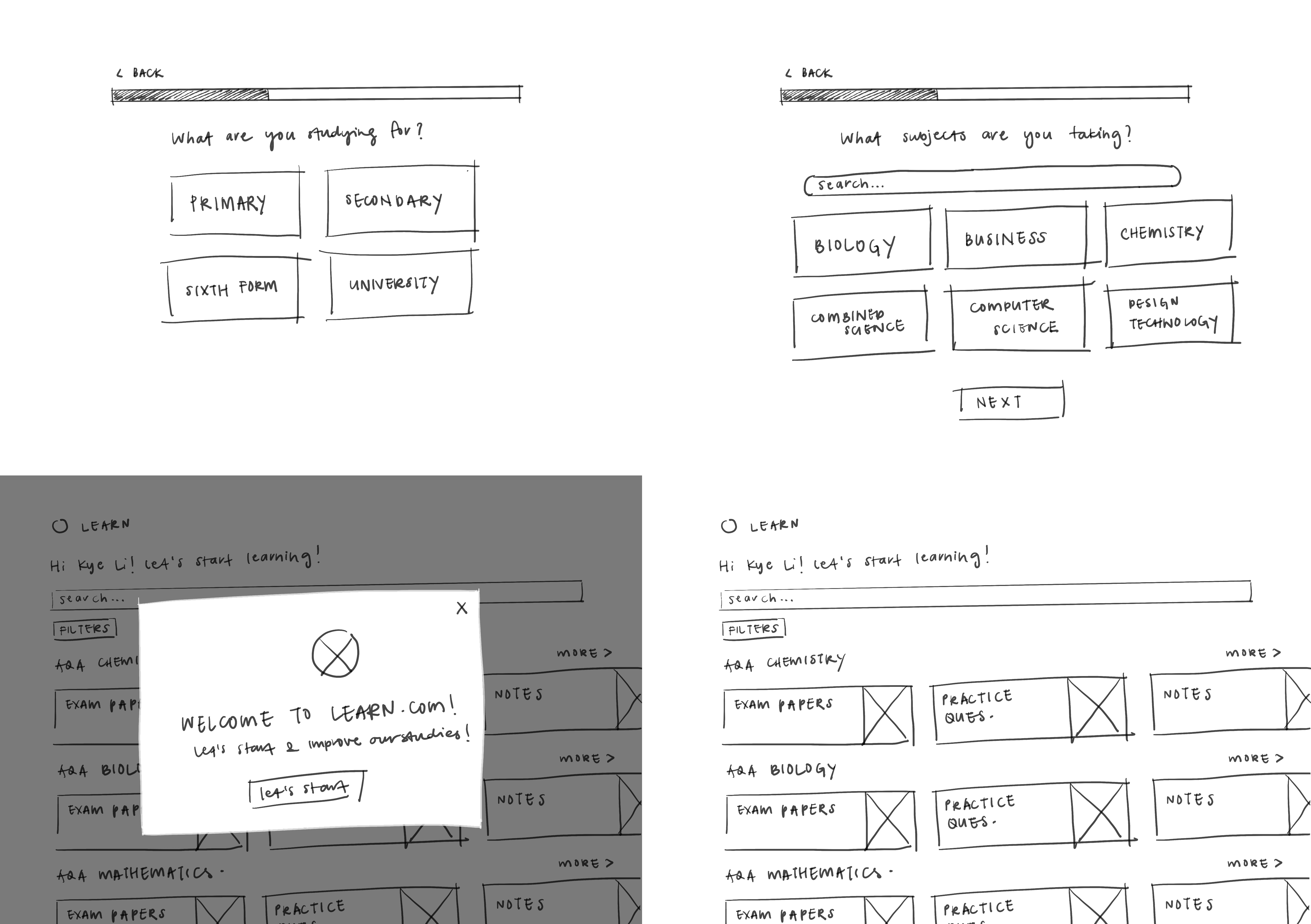

Quick ideation sketches.
![]()
![]() Low fidelity wireframes.
Low fidelity wireframes.


Final Designs

